In depth
Bank, lifetime lender, foundation.
Client
Hodge
What we did
Web design
Design system
Collaborator - Paul Robinson
Development - illustrate.digital
In banking terms Hodge is a young institution and remains an independent family controlled company. Therein lies the key to its culture and philosophy that sets it apart.
Hodge wanted to rethink its online presence, making it more visually arresting and coherent.
Together with their teams we developed a new visual language, layouts and site structure that would help them move from the silhouette illustrations of old to a friendlier, more unified brand.
“Over the years, Hodge has grown into several large areas, each with their own online presence which can appear to be quite segmented. Our aim of the redesign is to tie togther our site structure and have fidelity of presentation across all our platforms.”
Nathan Harrington
Hodge Marketing Manager
Initial investment
Building the user experience
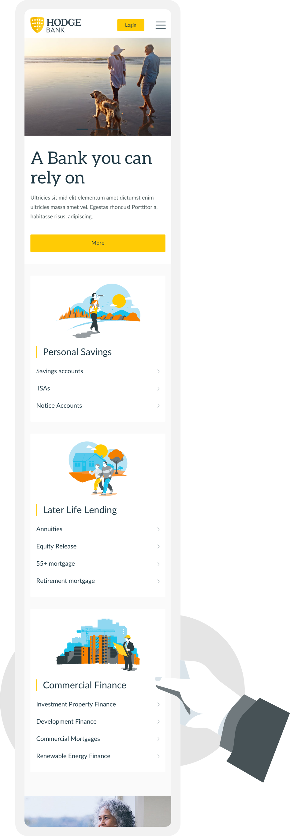
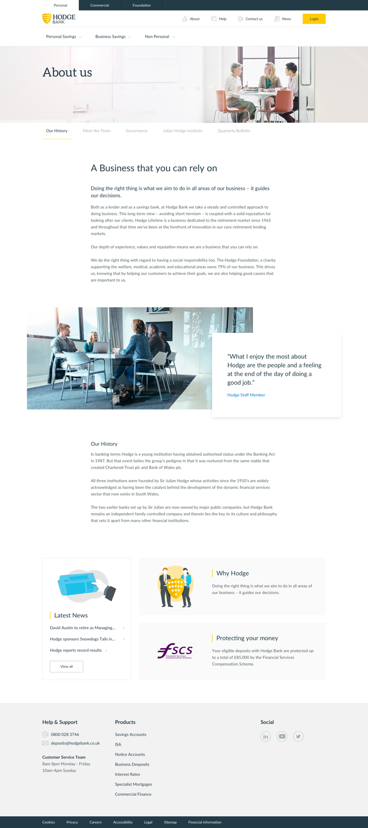
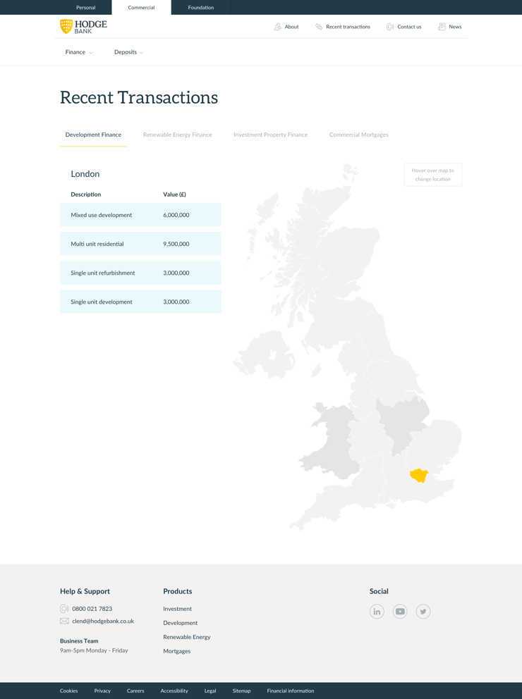
Hodge is made up of 4 key areas, Hodge Bank a lender and savings bank, for personal and commercial clients, Hodge Lifetime a business dedicated to the retirement market and The Hodge Foundation, a charity supporting the welfare, medical, academic and educational areas. Currently they all have very different, almost separate appearances (and urls).
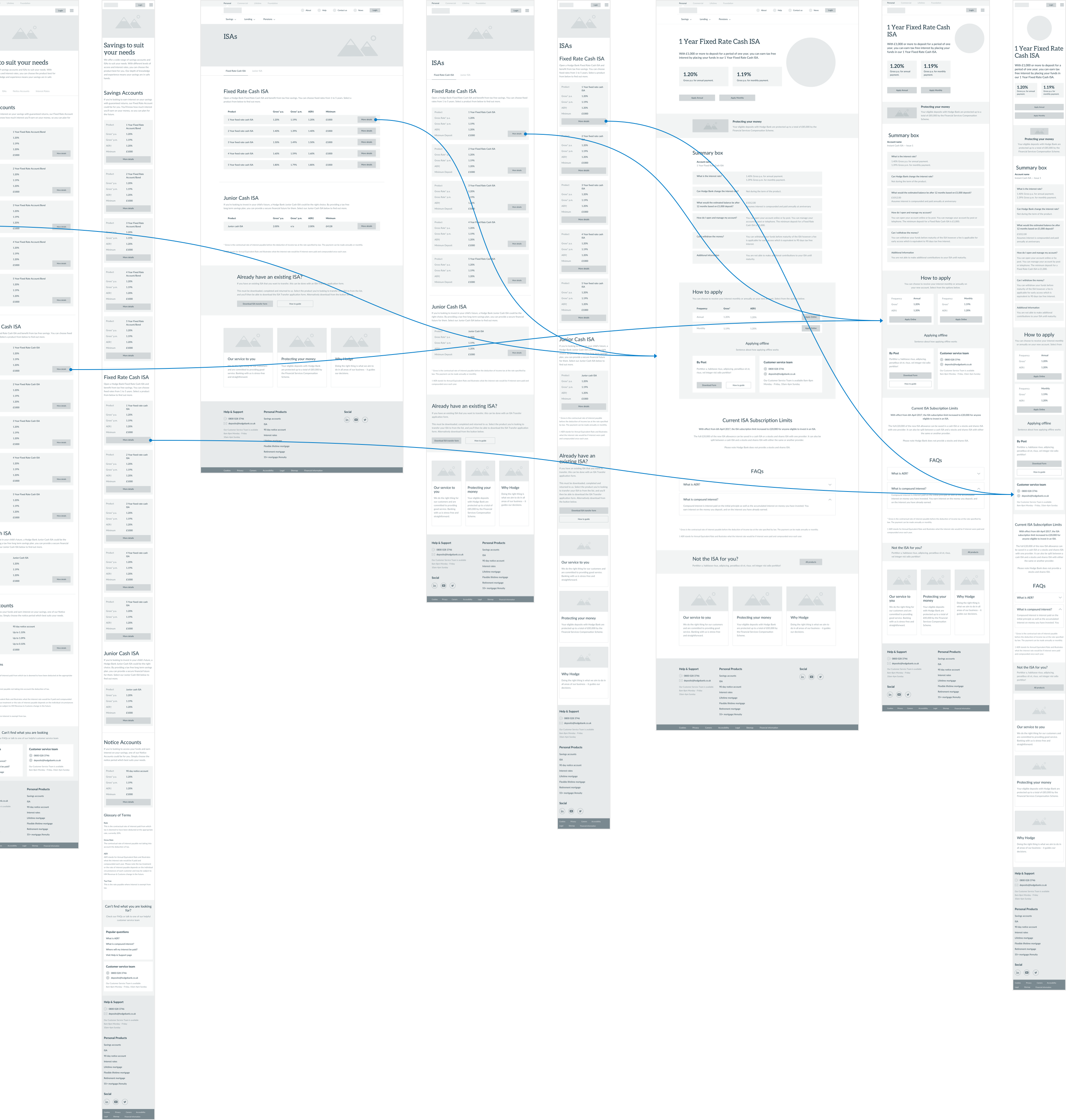
Developing the site structure was our first task. Analysing the existing structures and building upon it to bring all the sites together.


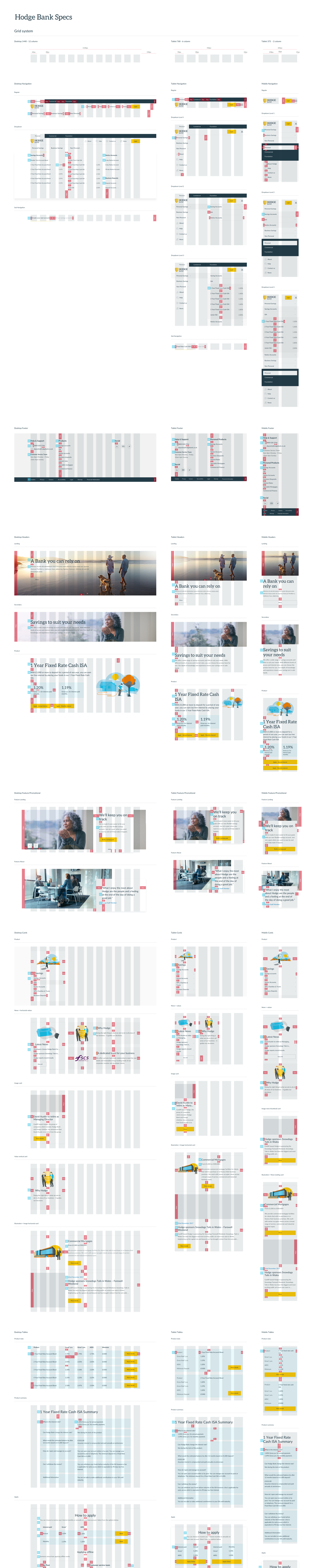
Templates
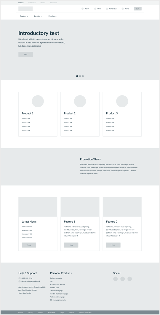
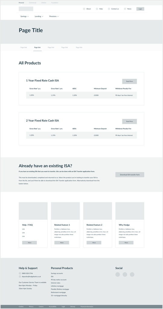
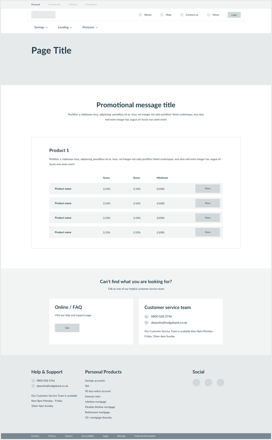
We identified page templates (9 in total), together with their responsive counterparts. The goal was to make the website feel more editorial and dynamic, keeping it modular enough for Hodge to expand it in the future without outside help.
User journeys
The pages get developed, user journeys created, and prototyped. This ensures the site is comprehensive, easy to navigate, and focuses on prospects, to increase the impact of hodgebank.co.uk on the bottom line.
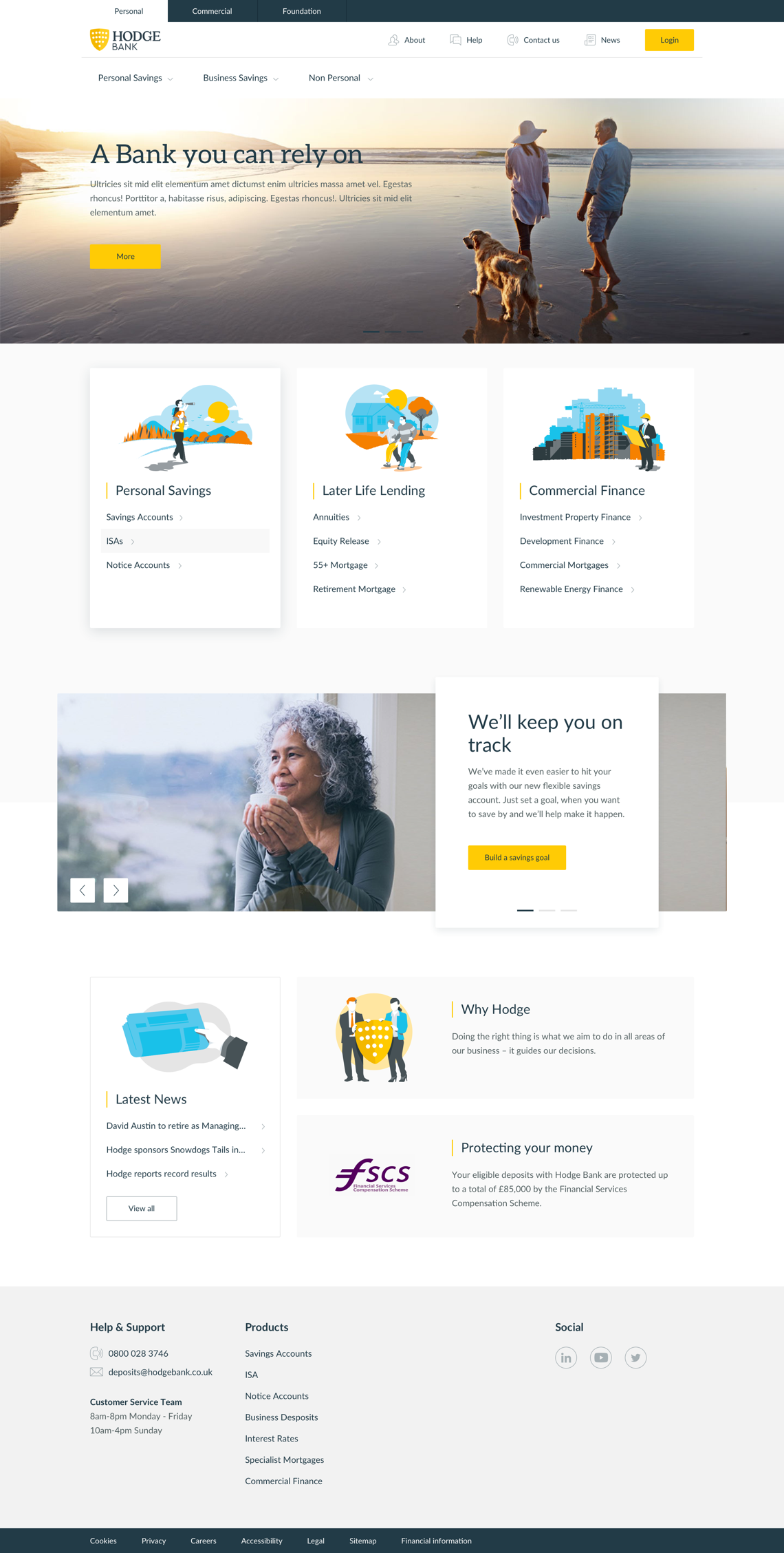
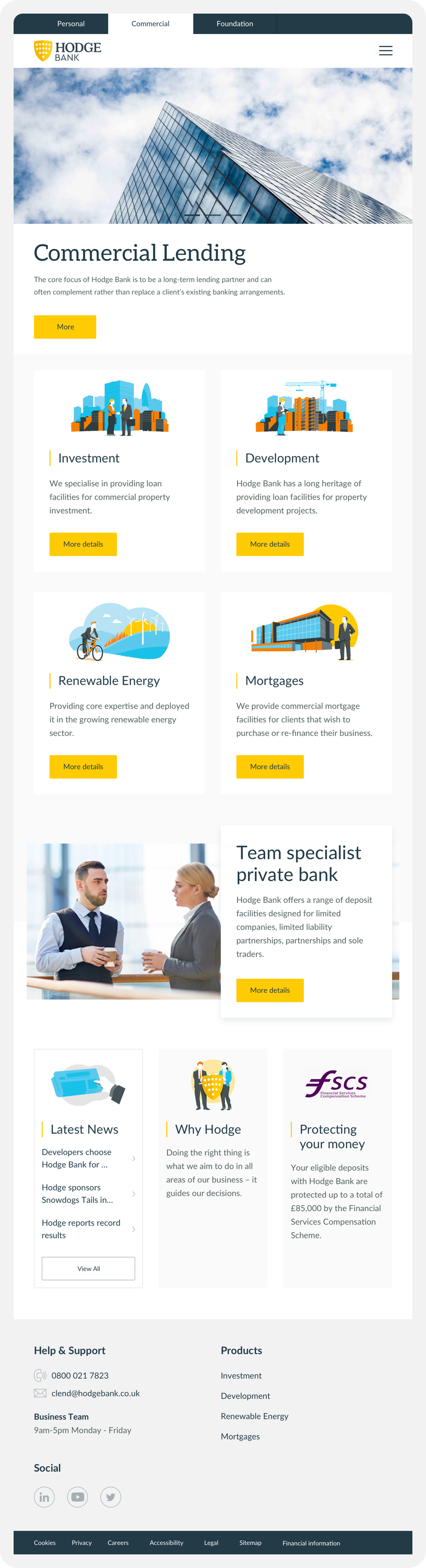
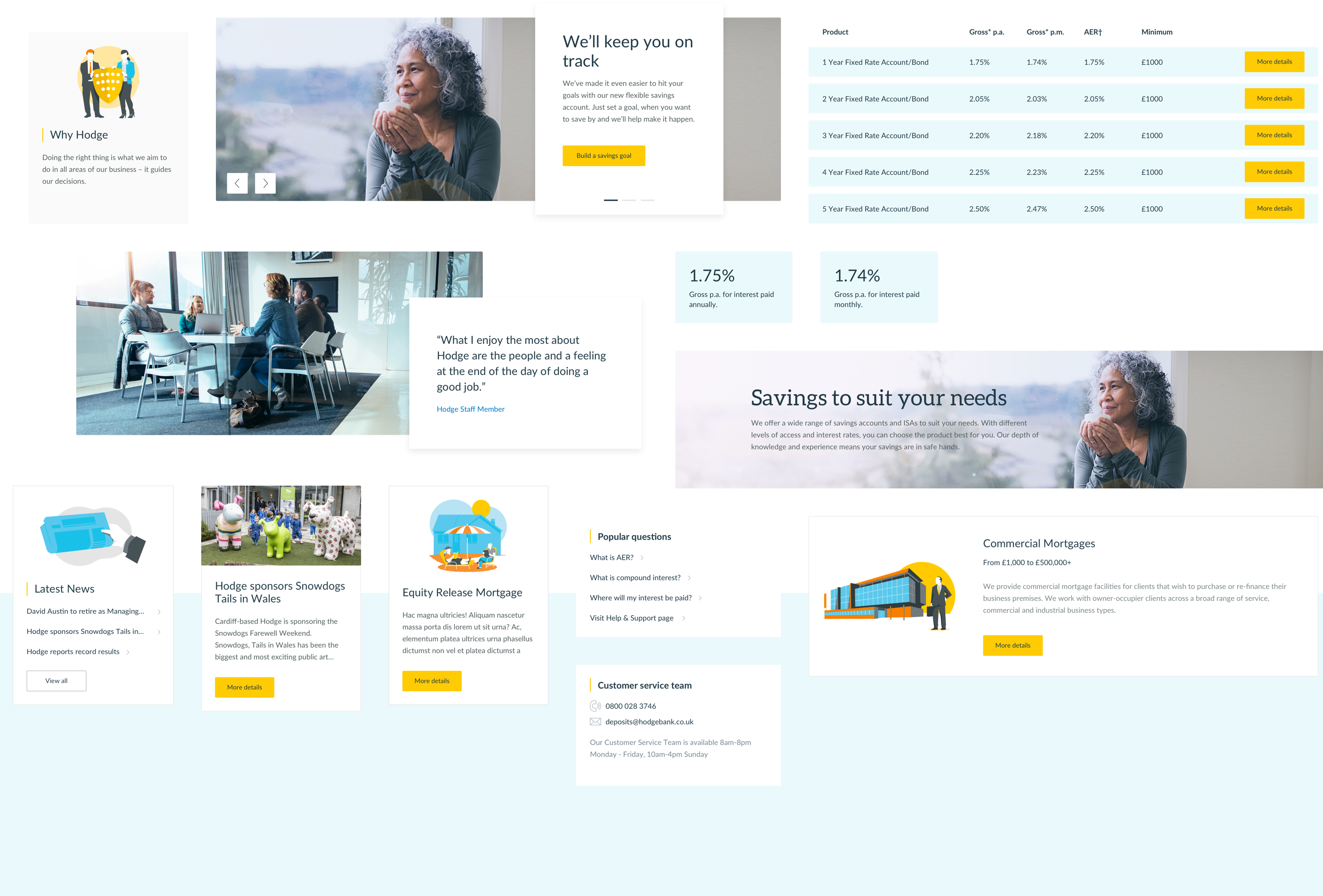
Home for all
Industry-specific landing pages
Industry-specific landing pages
Industry-specific landing pages
Hodge is different things to different people. The new landing pages cater to consumers and businesses, each addressing their industry-specific concerns.
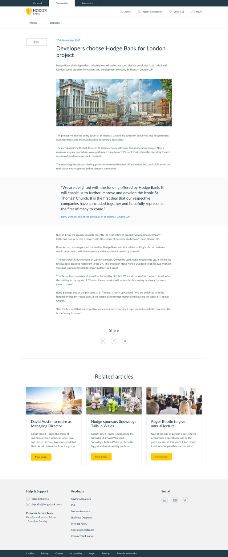
New photography, replaces the illustration heavy imagery of old to help humanises the company and on the approachable spirit of the brand, we kept the photography down to earth, unstuffy and not overly staged.
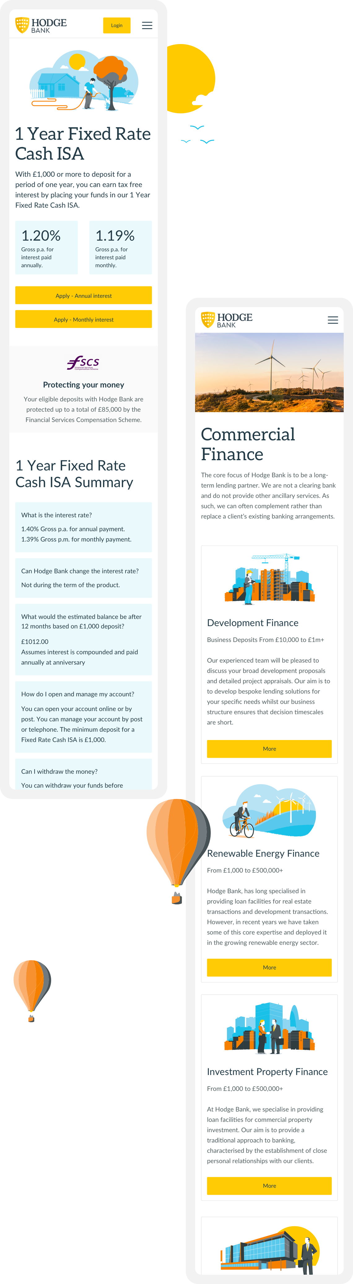
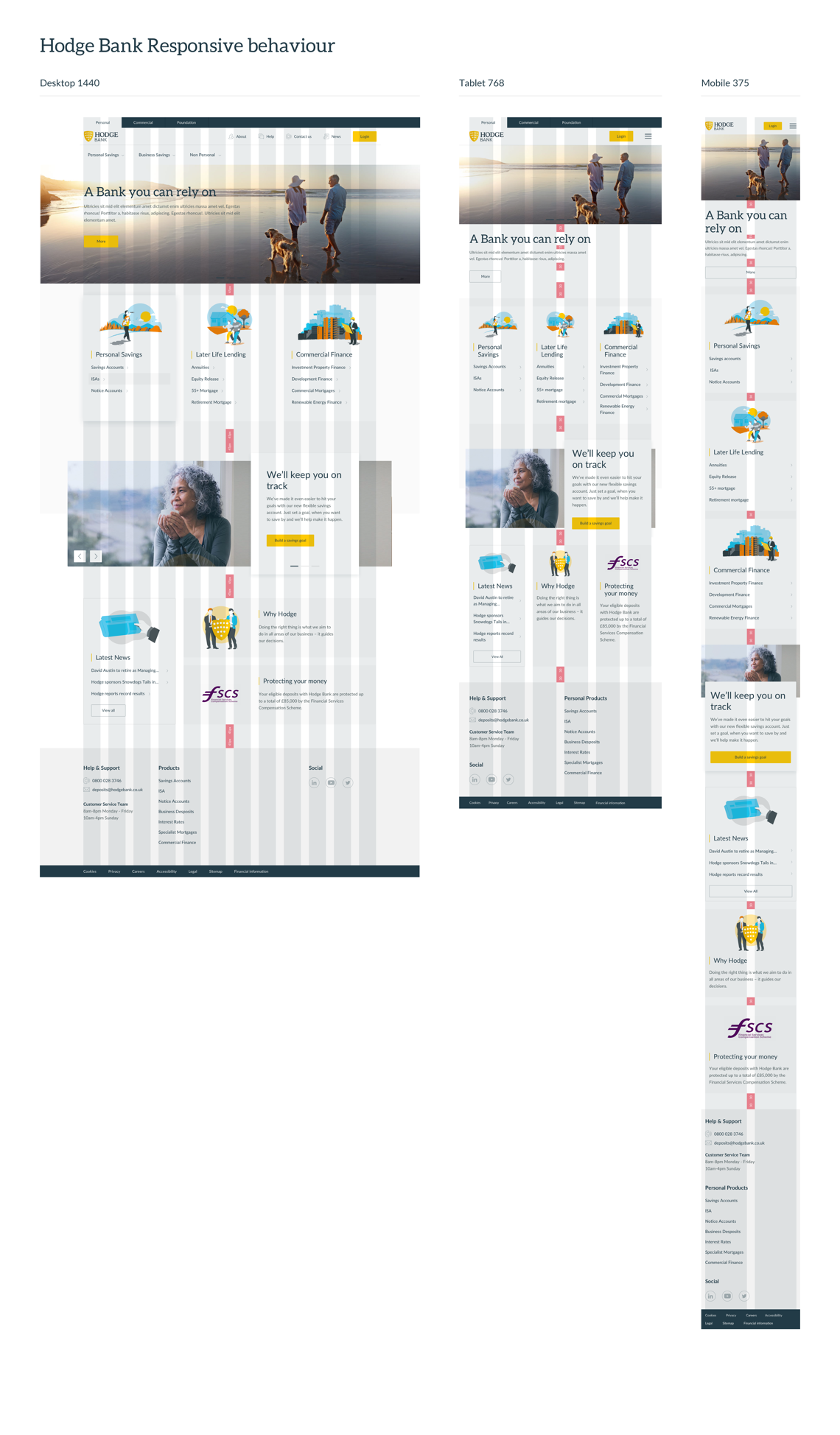
From small screens to big, the Hodge site is designed to look great everywhere.
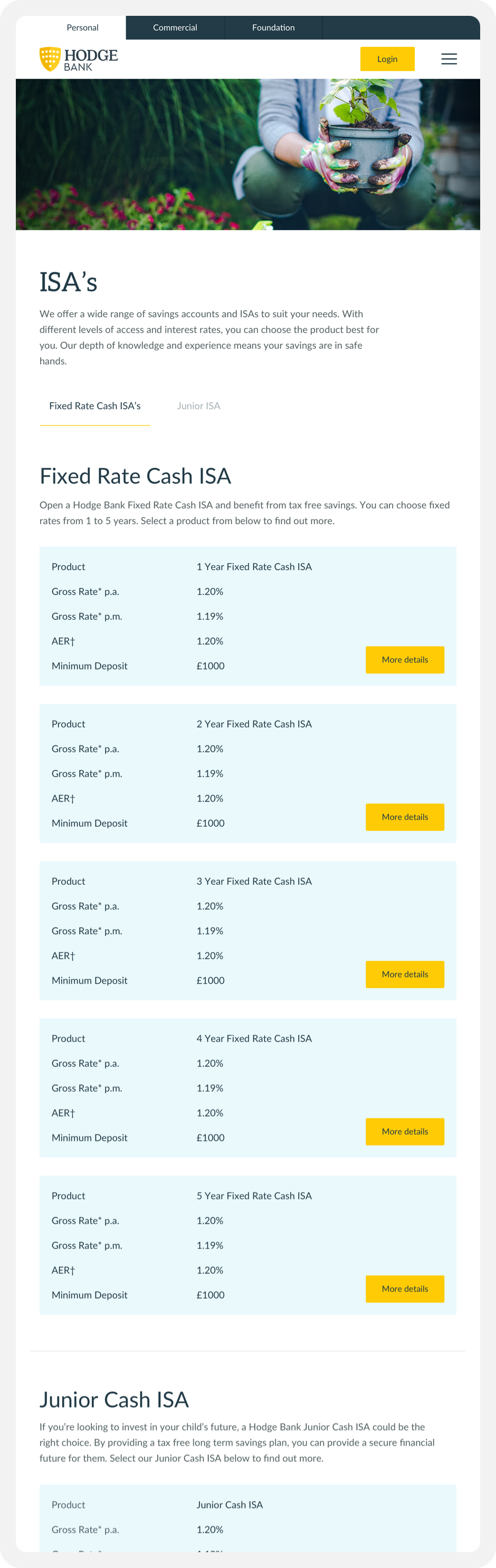
Product placement
Home for the products
Industry-specific landing pages
Industry-specific landing pages
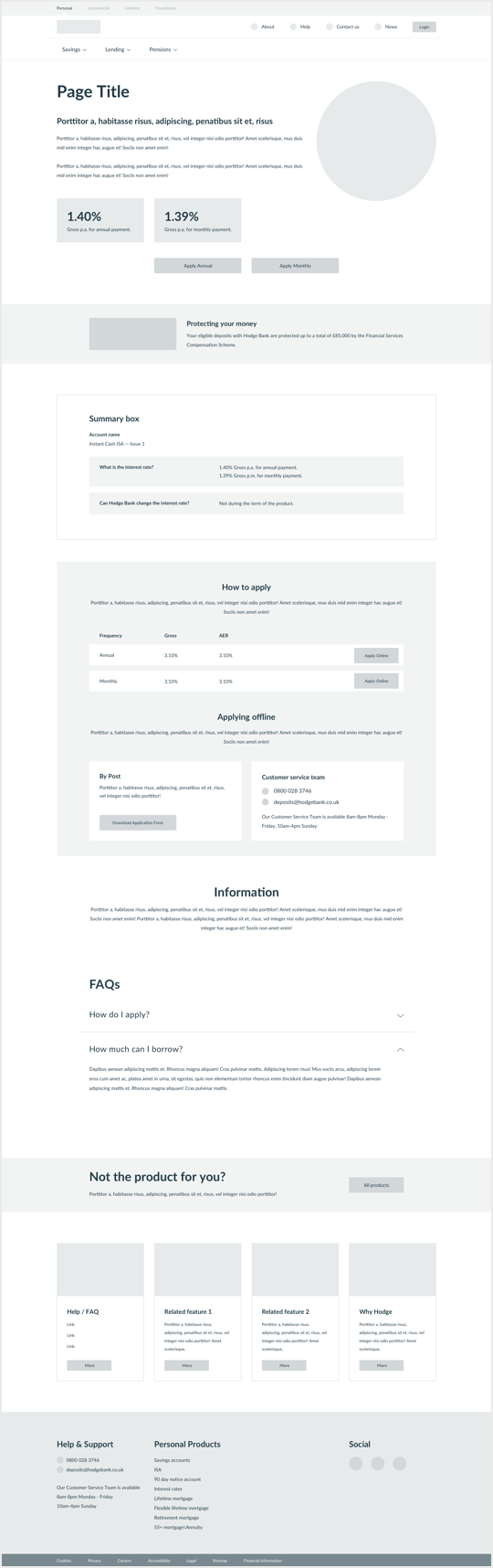
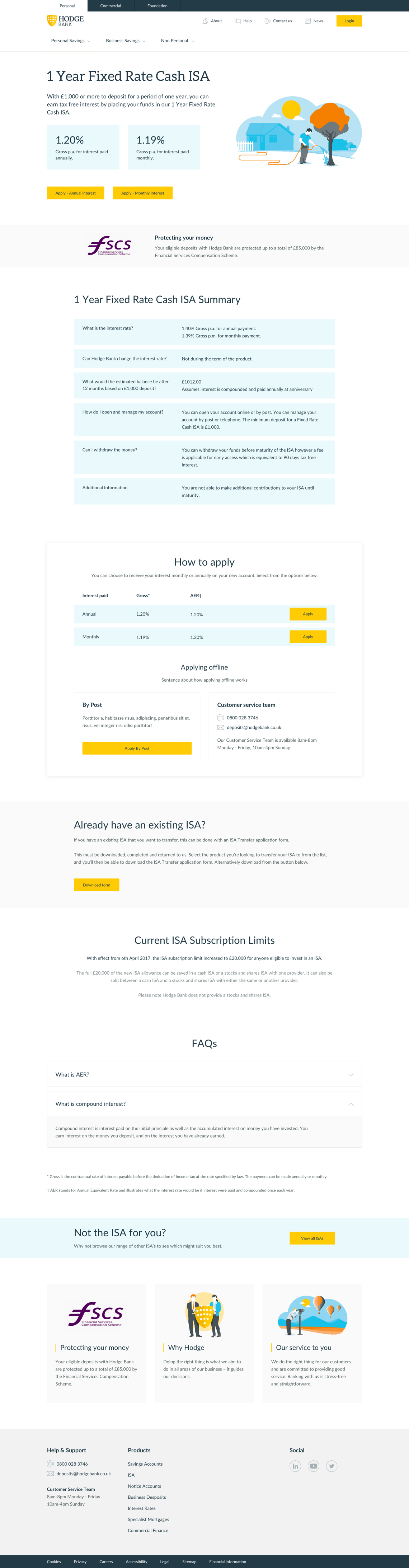
Banking can be complicated. For people who want to know what they’re getting into, we designed a set of product pages to reveal all. All these custom pages are represented by beautiful illustrations.
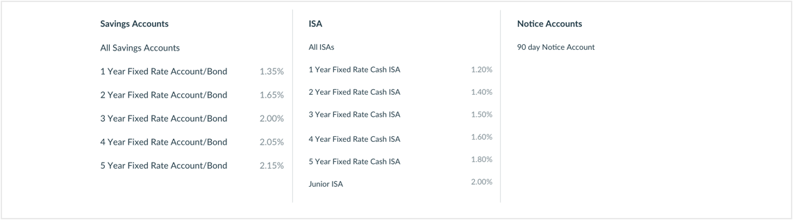
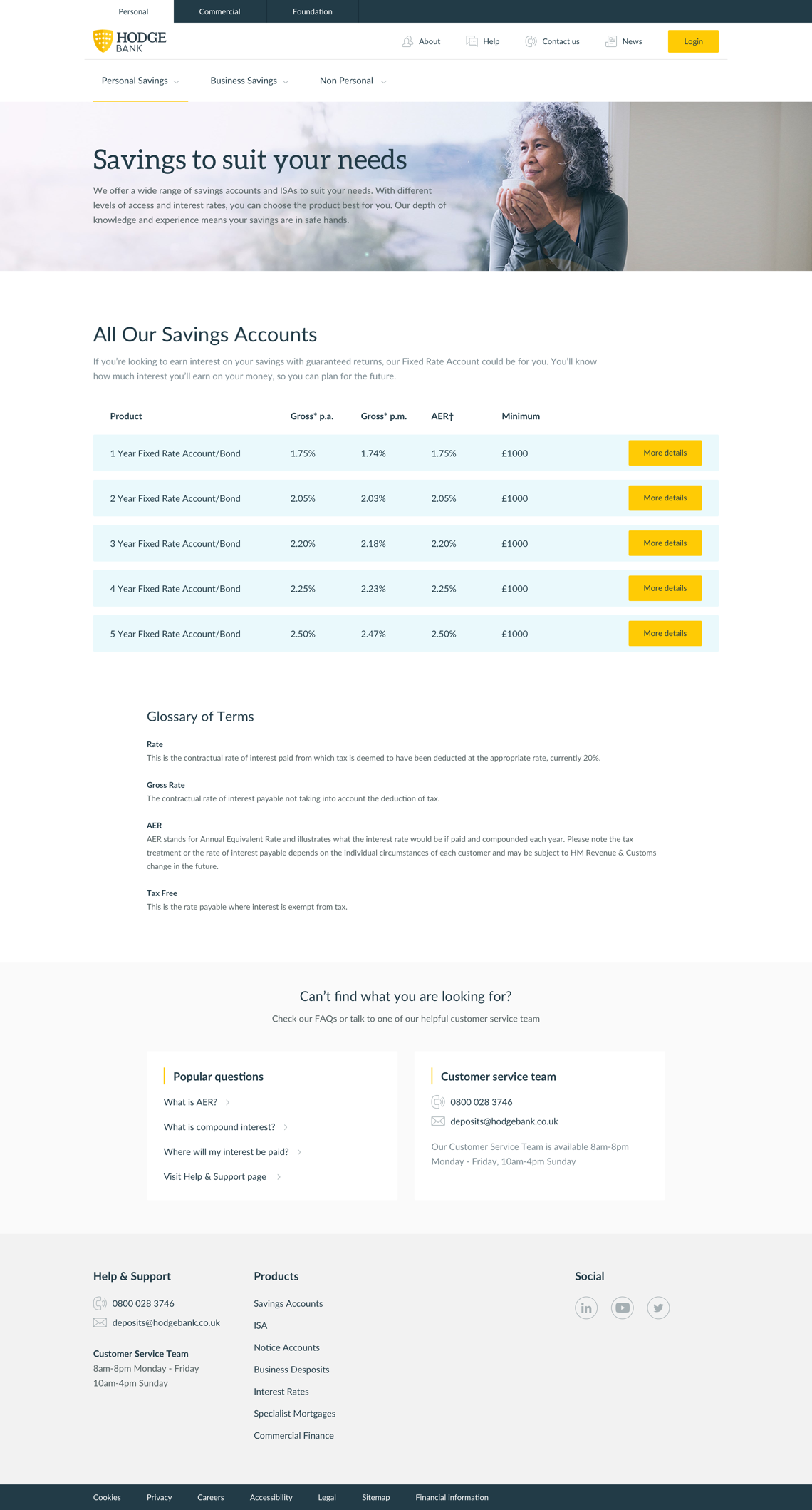
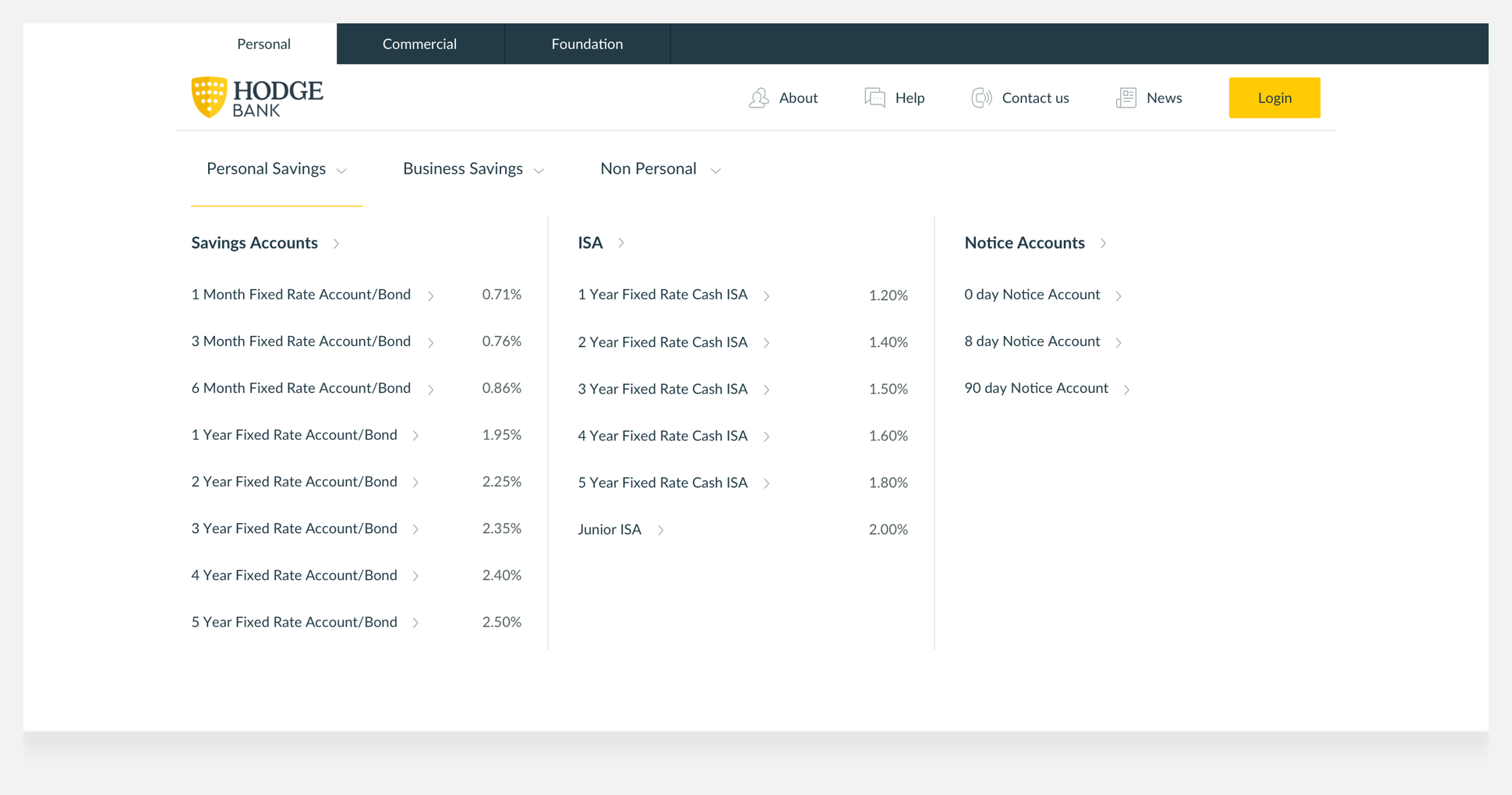
At the core of Hodge Bank are the rates available for savings for both personal and business. The most up-to-date interest rates are displayed live in the menu and across the relevant service pages.
…and some of the other interesting pages
Savings goal
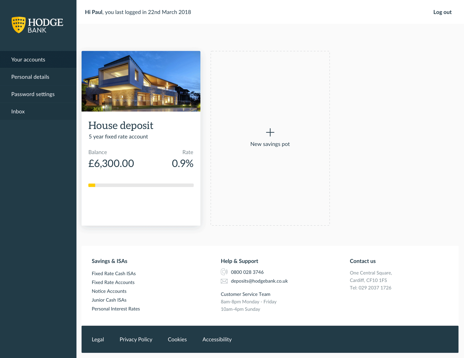
Hodge portal
The portal to another dimension… not really. The Hodge portal allows customers to login, set personal savings goals and track their progress.
Where to next?
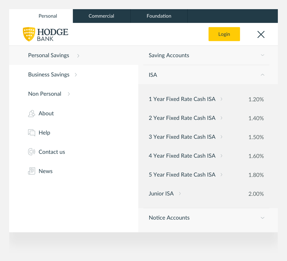
Better navigation
Key to the redesign was the revamp of core navigation elements, to make it easier for users to access key area and site. So that’s what we did.
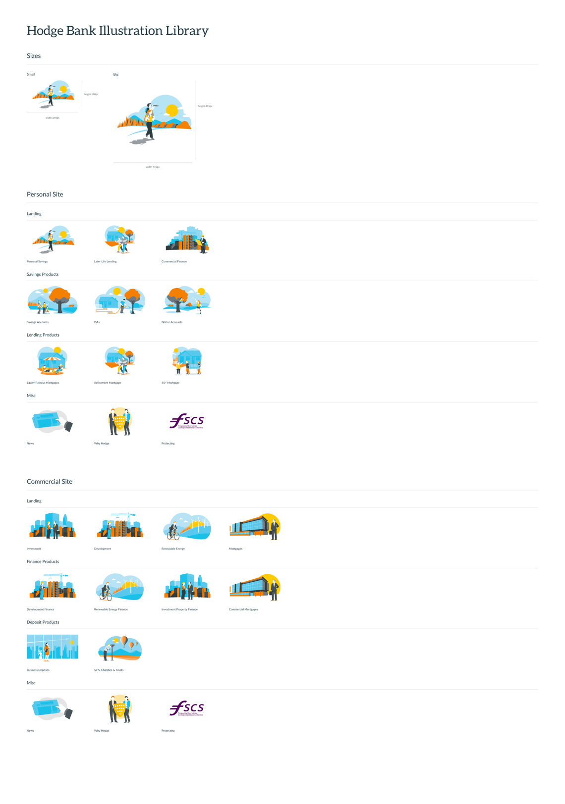
Hodge illustrated
Telling a story with pictures
We worked with Hodge to elevate its illustration game, maintaining consistency throughout the site with organic illustrative characters, that would represent each product.

Old style

New style


Structurally sound
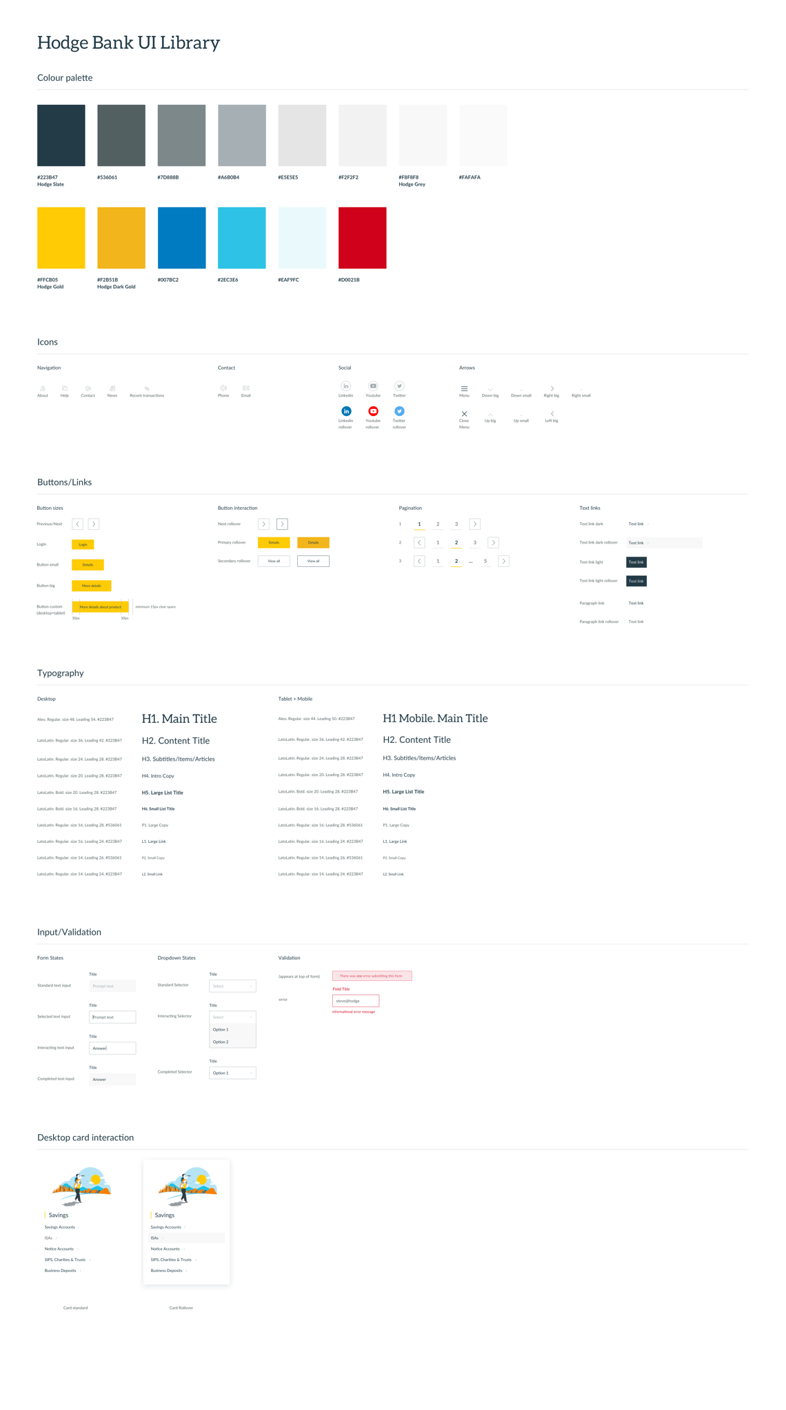
A flexible design system
Hodge.co.uk contains hundreds of pages in several categories, with very different purposes. We created a flexible design system full of typefaces, colours, icons, modules and all the other little things, that would give the site coherence without making it visually repetitive.

Main Title


Subtitle / Paragraph / Link


Browse more projects

© 2022 7robots ltd