In depth
Your personal market place.
Client
Paperclip
What we did
Brand strategy
Brand identity
Art direction
Product design
Web design
Advertising
Awards
Wales Online - Best Mobile App
Cardiff Life - Retailer of the Year
“In any house I’m sure you will find, 10, 20, 30 items that haven't been used in the last 5 years, and someone out there could be looking for that very thing you have under that N64 in the back of your wardrobe. Not only could someone be getting use out of these items but you could be getting something back in return…something you actually want.”
Rich Woolley
CEO, Paperclip
Let’s see some ID
Logo, typeface and colours
The name “Paperclip” comes from the true story of the man who started with a red paperclip and traded his way up to a house. The logo gives a subtle nod to this trading/addition story (and the core trading function of the product), as well as the iconic paperclip shape.
The construction of the brand was the starting point, to identify the traits associated with Paperclip. Trust, simplicity and reliability were keywords of focus, to not only try to create connections between the people interacting on the platform and also to the brand itself.


To the drawing board
The start of the product
The start of the product
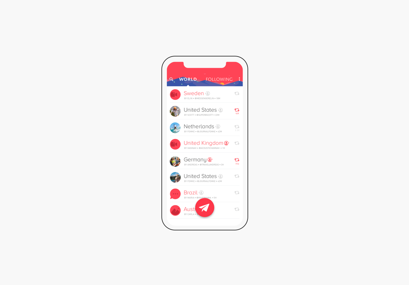
Early discussion brought to light the desire to assimilate the feeling of having your own local market or simply visiting one. Like any trade scenario, the “shop owners” needed transparent context about the offers being made on their items; who was making the offer, when it was made and most important, what they are offering.
On the other side, the “buyers” needed the same amount of information; fundamentals about the item they are interested in, it’s location, reliability of the “shop owner”, the best ways to communicate and constantly providing crucial feedback to the user who has made an offer or purchase, updating them on the progress and showing the results, encouraging future interactions and exploration.
Research
Insights

Setting the foundation
Building the initial user experience
The start of the product
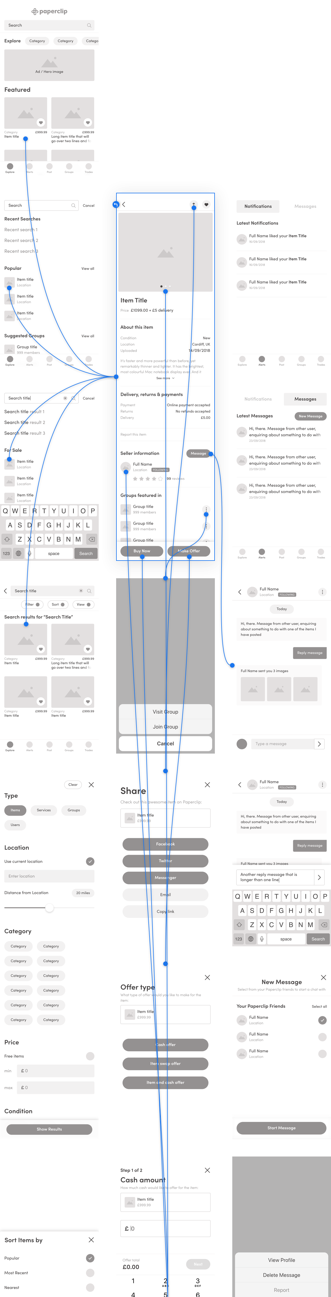
The product skeleton. Here we map out all the screens needed, how they are all going to link and the processes needed to do so. Only necessary features make the cut in the beginning, it’s a little too easy to get carried away with all the excitement of starting a new product. This ensures there is a solid foundation to build upon.
Early discussion brought to light the desire to assimilate the feeling of having your own local market or simply visiting one. Like any trade scenario, the “shop owners” needed transparent context about the offers being made on their items; who was making the offer, when it was made and most important, what they are offering.
On the other side, the “buyers” needed the same amount of information; fundamentals about the item they are interested in, it’s location, reliability of the “shop owner”, the best ways to communicate and constantly providing crucial feedback to the user who has made an offer or purchase, updating them on the progress and showing the results, encouraging future interactions and exploration.
To check the user experience aligns with the objectives set in the initial discussions, lo-fi digital versions (wireframes) of the screens are created, prototyped and tested to verify assumptions. These are great for gathering feedback on whether users can decipher hierarchy and navigate interactions without the distractions of colours and flashy visuals.
Early discussion brought to light the desire to assimilate the feeling of having your own local market or simply visiting one. Like any trade scenario, the “shop owners” needed transparent context about the offers being made on their items; who was making the offer, when it was made and most important, what they are offering.
On the other side, the “buyers” needed the same amount of information; fundamentals about the item they are interested in, it’s location, reliability of the “shop owner”, the best ways to communicate and constantly providing crucial feedback to the user who has made an offer or purchase, updating them on the progress and showing the results, encouraging future interactions and exploration.
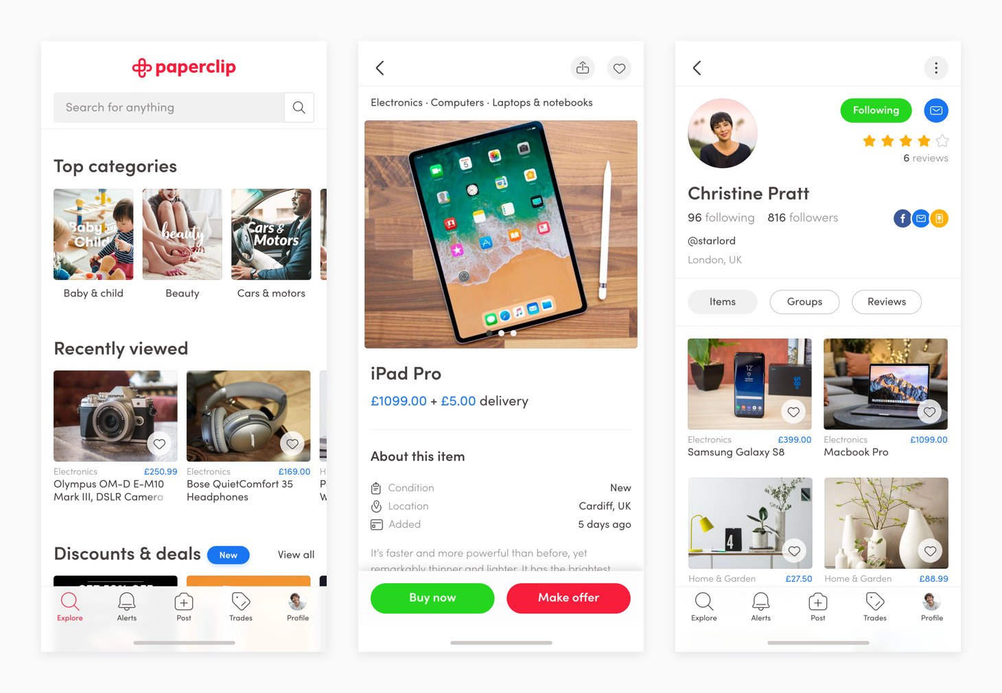
Putting U & I together
The user interface
The start of the product
Having a thoroughly thought out interaction design can make a product understandable and easy to use. But as we have learnt from seeing any child read a book, a visual layer delights and helps keeps us engaged.
Early discussion brought to light the desire to assimilate the feeling of having your own local market or simply visiting one. Like any trade scenario, the “shop owners” needed transparent context about the offers being made on their items; who was making the offer, when it was made and most important, what they are offering.
On the other side, the “buyers” needed the same amount of information; fundamentals about the item they are interested in, it’s location, reliability of the “shop owner”, the best ways to communicate and constantly providing crucial feedback to the user who has made an offer or purchase, updating them on the progress and showing the results, encouraging future interactions and exploration.
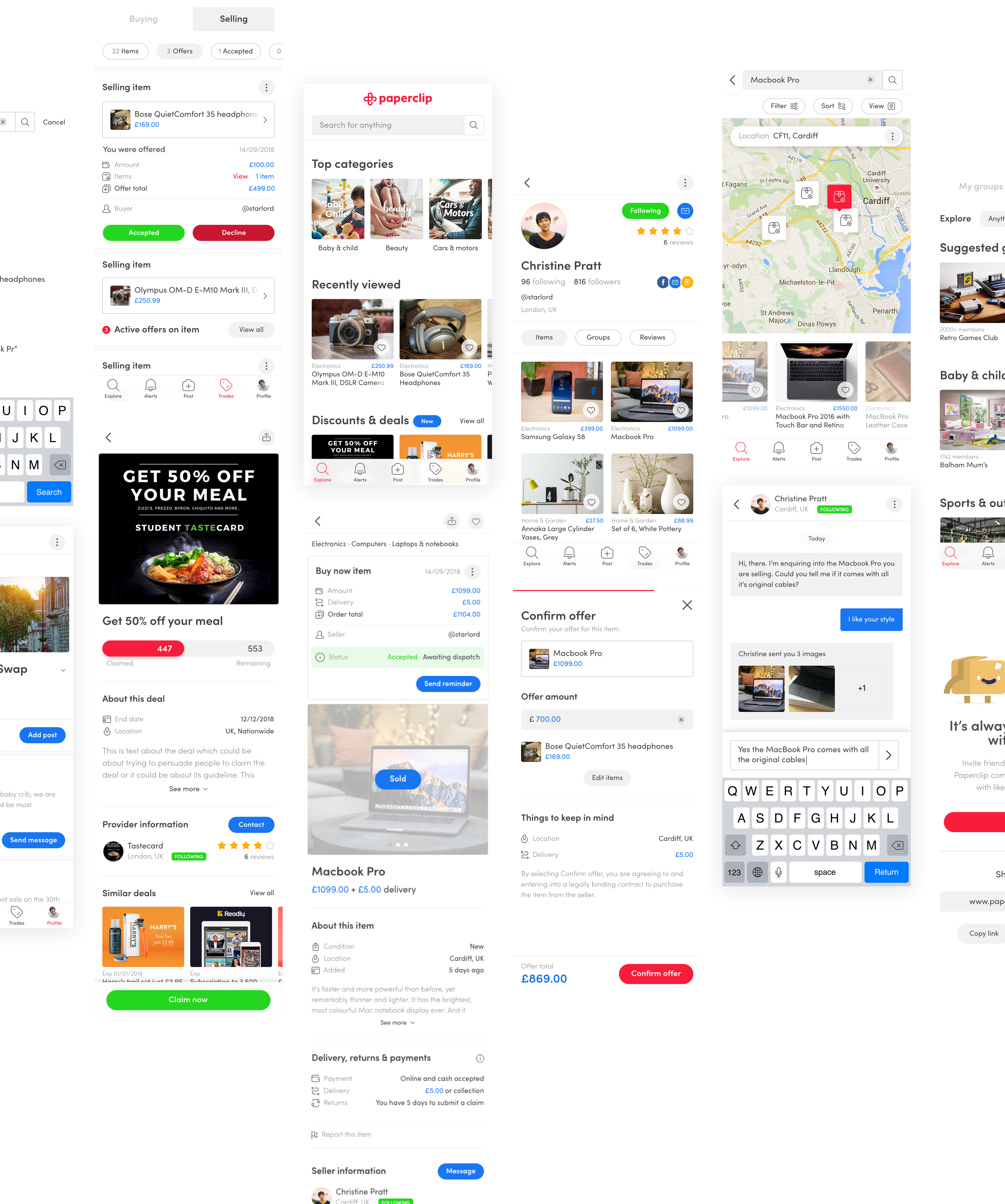
Prototyping gets called into the game again, this time to simulate the use of the final app. This for us was the most effective way to gain meaningful feedback from the team, investors and the invaluable user.
Once polished and everyone (the majority) is satisfied, everything is handed over to the development team, where they turn the all planning, sketches, wireframes, prototypes, designs, more prototypes, into the product you download.
Early discussion brought to light the desire to assimilate the feeling of having your own local market or simply visiting one. Like any trade scenario, the “shop owners” needed transparent context about the offers being made on their items; who was making the offer, when it was made and most important, what they are offering.
On the other side, the “buyers” needed the same amount of information; fundamentals about the item they are interested in, it’s location, reliability of the “shop owner”, the best ways to communicate and constantly providing crucial feedback to the user who has made an offer or purchase, updating them on the progress and showing the results, encouraging future interactions and exploration.
We are family
Icons for every occasion
The start of the product
The new version paved the way for a custom icon family for use in various product contexts. Related to the logo, they all derive from it elements like weight, shapes and geometry.
Early discussion brought to light the desire to assimilate the feeling of having your own local market or simply visiting one. Like any trade scenario, the “shop owners” needed transparent context about the offers being made on their items; who was making the offer, when it was made and most important, what they are offering.
On the other side, the “buyers” needed the same amount of information; fundamentals about the item they are interested in, it’s location, reliability of the “shop owner”, the best ways to communicate and constantly providing crucial feedback to the user who has made an offer or purchase, updating them on the progress and showing the results, encouraging future interactions and exploration.
Trading up
Evolution of the Paperclip app
The start of the product
As Paperclip continued to grow, new versions of the app were required to refine, adapt, improve and introduce new features to streamline the ever-evolving demands of users.
Early discussion brought to light the desire to assimilate the feeling of having your own local market or simply visiting one. Like any trade scenario, the “shop owners” needed transparent context about the offers being made on their items; who was making the offer, when it was made and most important, what they are offering.
On the other side, the “buyers” needed the same amount of information; fundamentals about the item they are interested in, it’s location, reliability of the “shop owner”, the best ways to communicate and constantly providing crucial feedback to the user who has made an offer or purchase, updating them on the progress and showing the results, encouraging future interactions and exploration.
Version 1
Our first creation focused on on the core trading mission of the app.
Our first creation focused on on the core trading mission of the app.
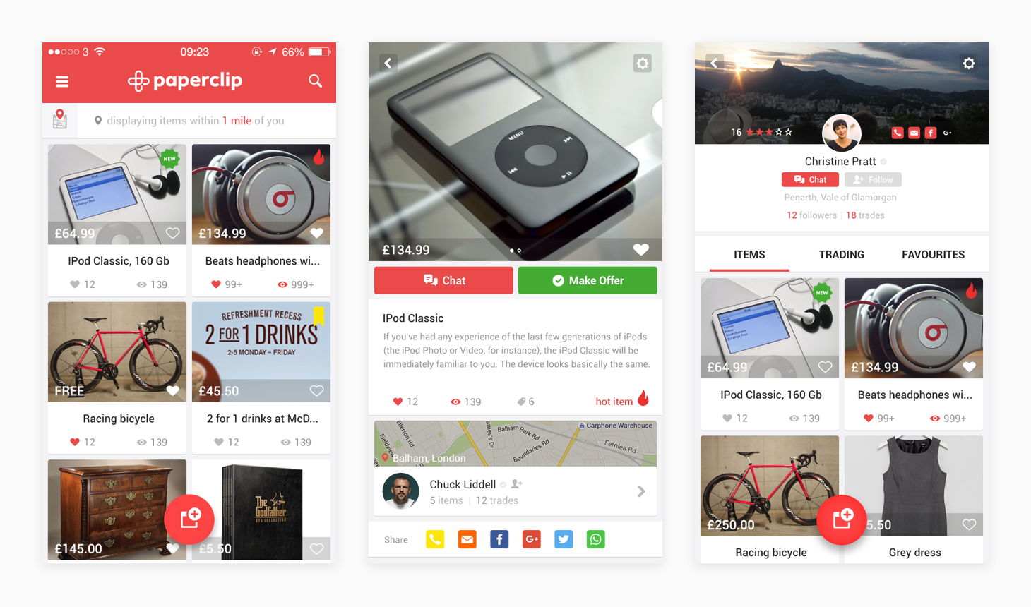
Version 2
The introduction of Paperclip groups. Groups enables users to connect with likeminded people who have a shared common interest, goal, grand parent…
New features
· Groups
· The bold move to remove the price of items
· Introduction of a web/desktop version
Our first creation focused on on the core trading mission of the app.

Version 3
With so many items in so many categories, we focused on helping users find what they’re looking for, even when they’re not sure what it is yet.
New features
· Added price of items back
· Streamlined adding processes
· Collections
· Deals
· Online payment and delivery system
Our first creation focused on on the core trading mission of the app.
Seeing the big picture
Paperclip on the world wide web
Paperclip on the world wide web
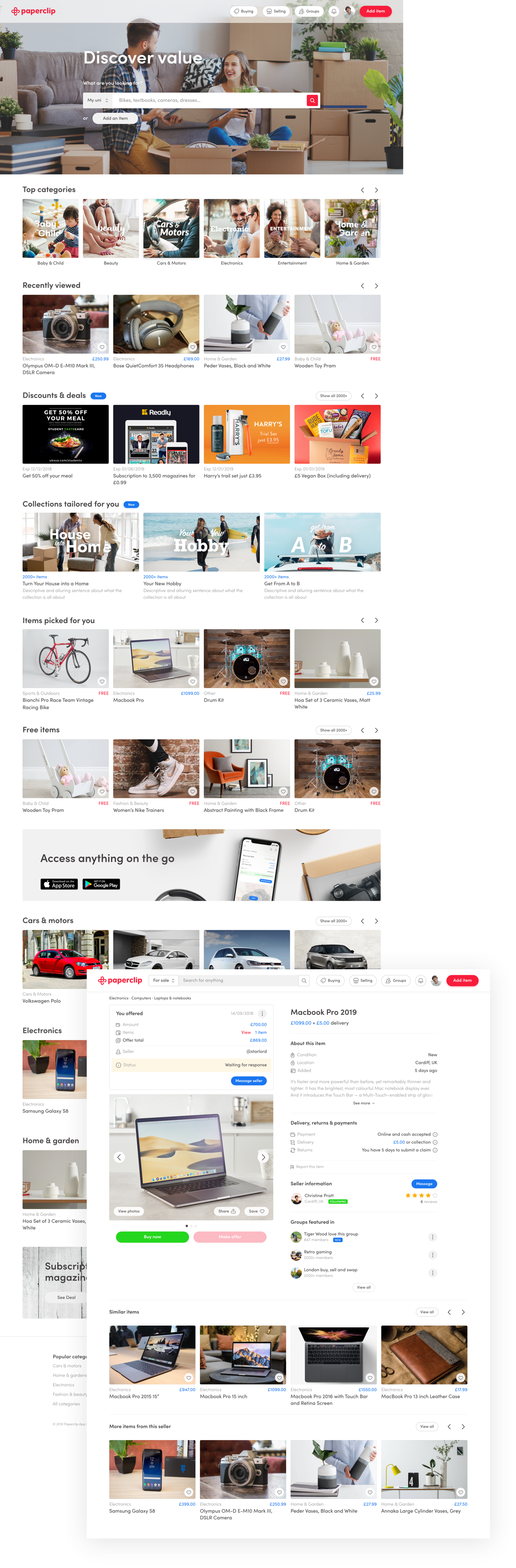
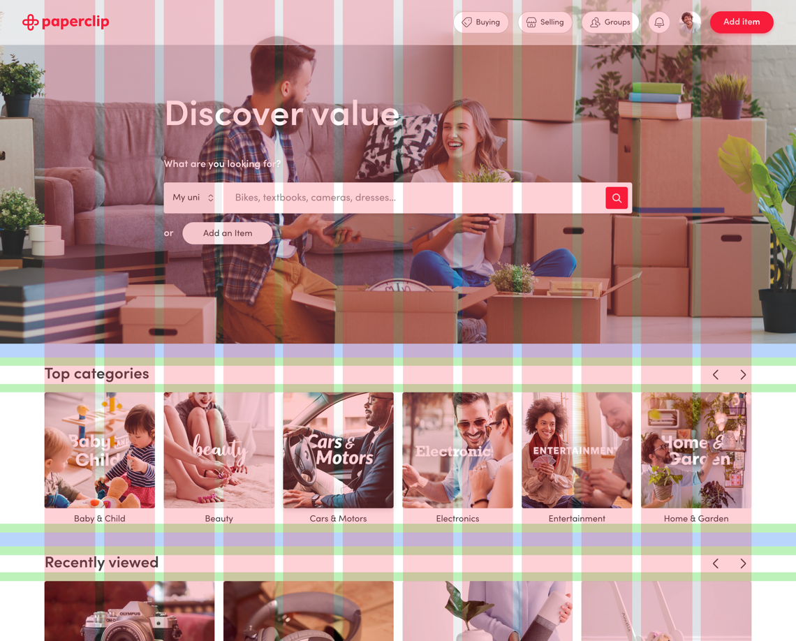
Paperclip is about getting you deals where you want, when you want, and on the platform you prefer. After designing versions for both iOS and Android, we moved on to a desktop version that would be accessed from any browser.
Paperclip is about getting you deals where you want, when you want, and on the platform you prefer. After designing versions for both iOS and Android, we moved on to a desktop version that would be accessed from any browser.
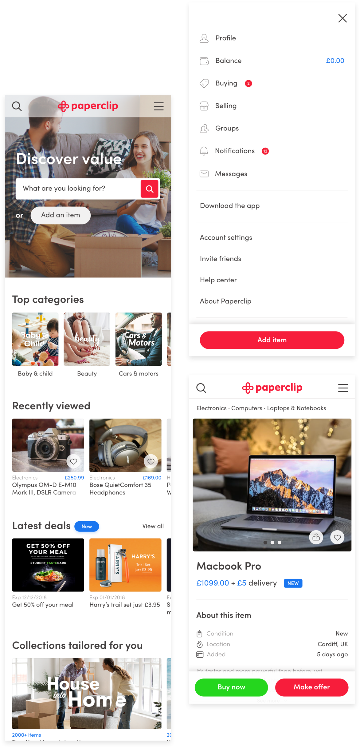
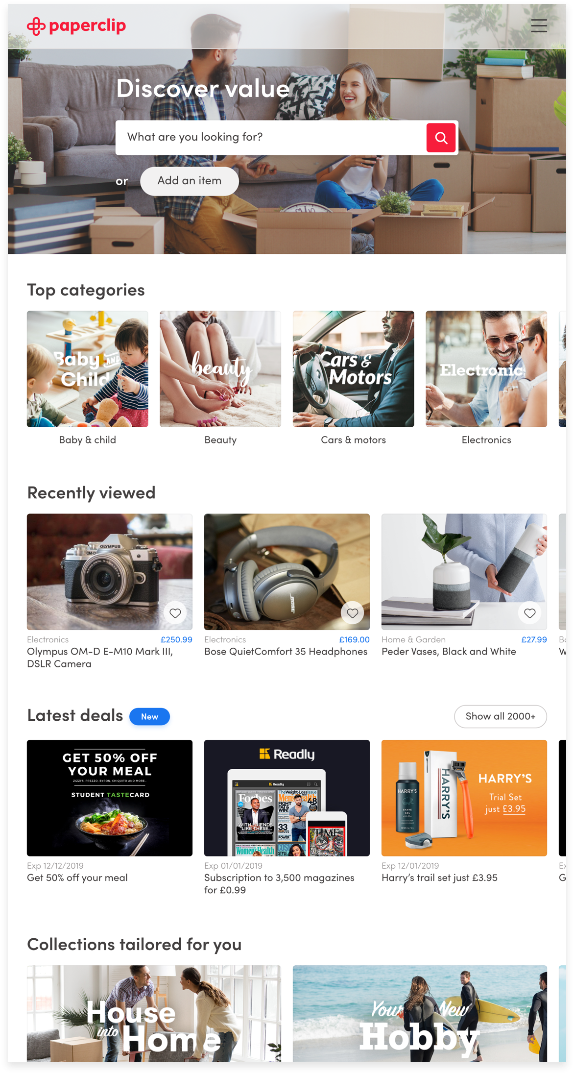
Comes in all sizes
A responsive design
The start of the product
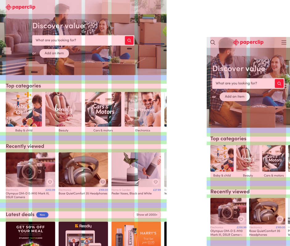
We all know that shoppers don’t limit themselves to a desktop experience anymore. From small screens to big the Paperclip site is designed to look great everywhere.
Early discussion brought to light the desire to assimilate the feeling of having your own local market or simply visiting one. Like any trade scenario, the “shop owners” needed transparent context about the offers being made on their items; who was making the offer, when it was made and most important, what they are offering.
On the other side, the “buyers” needed the same amount of information; fundamentals about the item they are interested in, it’s location, reliability of the “shop owner”, the best ways to communicate and constantly providing crucial feedback to the user who has made an offer or purchase, updating them on the progress and showing the results, encouraging future interactions and exploration.
Responsive behaviours
12·6·2 column grid | 24px block spacing | 16px inner padding
The building blocks
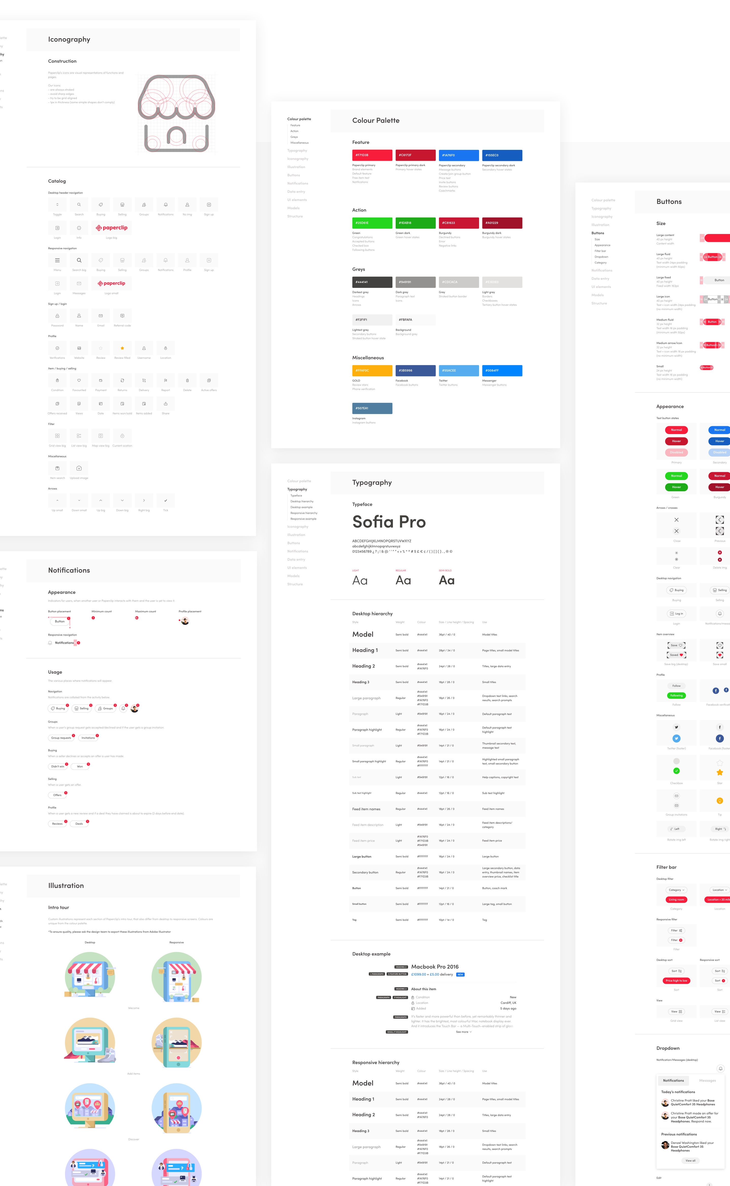
A flexible design system
The start of the product
Paperclip has become a robust identity, containing hundreds of pages on multiple platforms. Flexible design systems were created for the desktop and app, full of typefaces, colours, icons, modules and all the other little things, to help give the screens fidelity across all platforms.
Early discussion brought to light the desire to assimilate the feeling of having your own local market or simply visiting one. Like any trade scenario, the “shop owners” needed transparent context about the offers being made on their items; who was making the offer, when it was made and most important, what they are offering.
On the other side, the “buyers” needed the same amount of information; fundamentals about the item they are interested in, it’s location, reliability of the “shop owner”, the best ways to communicate and constantly providing crucial feedback to the user who has made an offer or purchase, updating them on the progress and showing the results, encouraging future interactions and exploration.
The stock take
Numbers and accolades
Since the launch, people have been using it and seem to like it… voted top 10 best new digital business in Wales, winner to Dave’s “Money pit” tv show, “Retailer of the Year” at the Cardiff Life Awards and “Best Mobile App” at the Wales Online Digital Awards, amongst a couple of other popular news features.
#1
featured shopping app in app store
150k
downloads in less than 6 months
50k
items added in less than 6 months
“When it comes to moving into halls and student digs, there’s usually a lot of stuff you need to buy - from books and computer equipment to household essentials like pots and pans. It's all too easy to deplete your student loan overnight, which is where trading in your unwanted kit can be handy. That's the DNA of Paperclip.”
Lifehacker UK
March 2018
Further education
Target shift - students
Once the dust had settled and it was time to reflect on what we had created, some analytics shown through brightest:
· 36% of users were currently or were recently a student
· 38% were unwilling to try a peer-to-peer marketplace due to the fact that they didn’t trust the other users.
How do we combat this? One of the most proven ways to build trust is by find a shared interest that you have in common with someone else e.g. an institution or university… (light bulb) university marketplaces.
Seeing if bespoke university marketplaces had value, we held specific student focus groups and surveys. 85% would be more likely to trade with another user if they knew they were from the same university.
University marketplaces were born.

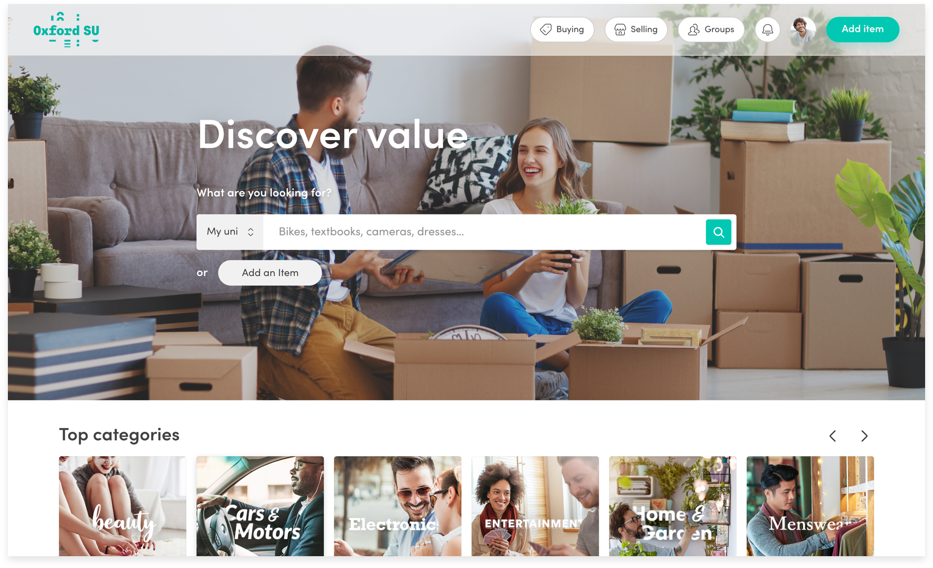

Specific collections tailored to students
Making the grade
The progress
Paperclip is currently the leading provider of student marketplaces. Currently in 22 universities across the UK including Oxford, Cambridge, UCL and Imperial.
This includes a network of 100 student ambassadors who promote discounts and offers from acquired partnerships, including: Just Eat, Giff Gaff, Graze, Tastecard, and Readly.
Browse more projects
© 2022 7robots ltd